Harley’s Raw Organic Pet Food
Organic Dog Food E-Commerce App
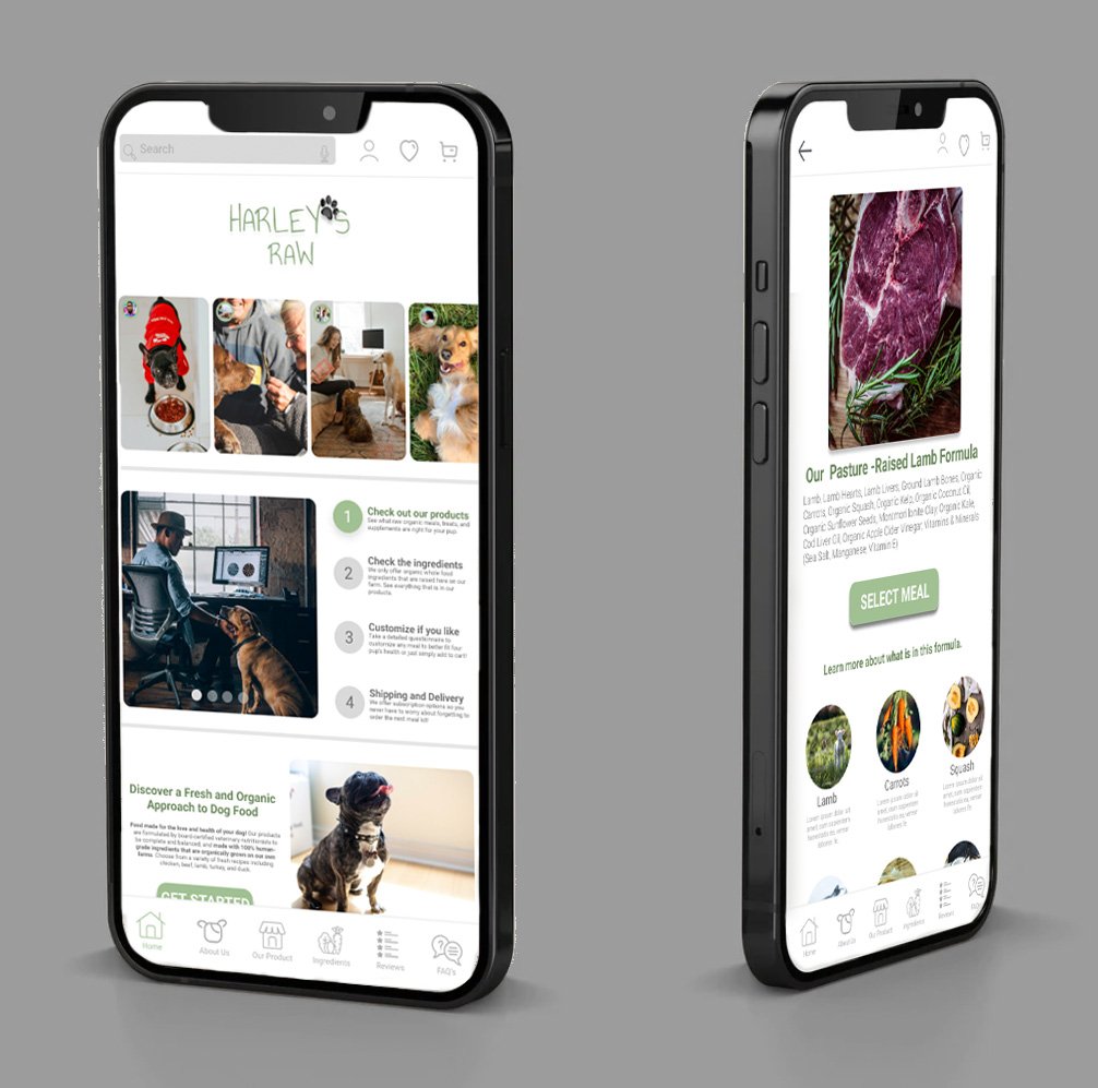
Project Vision: Harley’s Raw mobile app offers viewers a place to learn about the brand & order organic pet food that is open & honest about the ingredients in the dog meal formulas available.
Challenges
Working adults on-the-go have tight schedules & limited time to prep meals for their dogs.
Most dog food brands use buzzy & misleading words that customers do not understand or fully describe what ingredients are in the dog food.
Pet owners would like to have a way to receive meals on-time, at-home, on a recurring schedule to avoid forgetting to purchase.
The Full Design Process
Kickoff
In this project, I took a goal-directed design approach: To design an app to preview ingredients for an organic dog food brand. As this was a certification class project, quantitive research methods were the primary method of research, contacted with class piers & personal contacts. Quantitive research consisted of competitive audits, stakeholder interviews, & persona hypothesis construction.
Some questions I asked myself to start off this project…
“What are pet owners not receiving from their current dog food brands?”
“What are the typical needs of a pet owner when looking for dog food meals?”
“What are the competitors doing well?”
“What do vets think about dog food brands and what dogs need?”
Meet the Users
Problem Statement: Cristina is a dedicated health professional who is looking for a nutritious organic meal to feed her dog because she does not feel satisfied with current pet store offerings.
Problem Statement: Joey is a busy accountant who needs customized meal offerings for his dog that is prone to obesity and other health issues.
Competitive Audit
I looked into several potential competing dog food brands that offer either organic dog food or a way to customize a dog’s meal kit in a convenient way for the owner. The key brands I focused my research on was: The Farmer’s Dog (direct), Ollie (direct), Sundays (direct), & Chewy (indirect).
The majority of the features of each brand were somewhat similar, however I noticed small gaps in each offering & found key areas for opportunity:
Open & honest description of all ingredients
Dog questionnaire to customize the meal for each dog
Meal variety options
Subscription accessibility & flexibility
Creating the User Journey
Wireframes
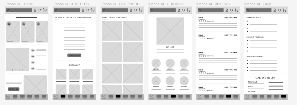
First digital wireframe based off of sketches of paper wireframes. This first round help me think through the preliminary flow the user would take from the home page. Before moving on to visuals, there were several steps I was missing to make the users journey successful & easy.
The second phase of wireframe consisted of starting a low-fidelity prototype. This phase I added a user log-in, view cart, view favorites, and a checkout view.
This first low-fidelity prototype was tested in early stage usability tests with five different participants locally involved in nearby pet-stores in Brooklyn, NY. Four main pain points emerged:
Participants were confused on how items went straight to their cart after looking through ingredients.
No way to customize the meal for their own dog.
Subscription & auto-ship delivery options not visible.
No way to understand if the order was successful.
Refined with another quick usability test with classmates, Low-Fidelity Prototype #2 checked all the boxes for the user’s needs & satisfied their major pain points.
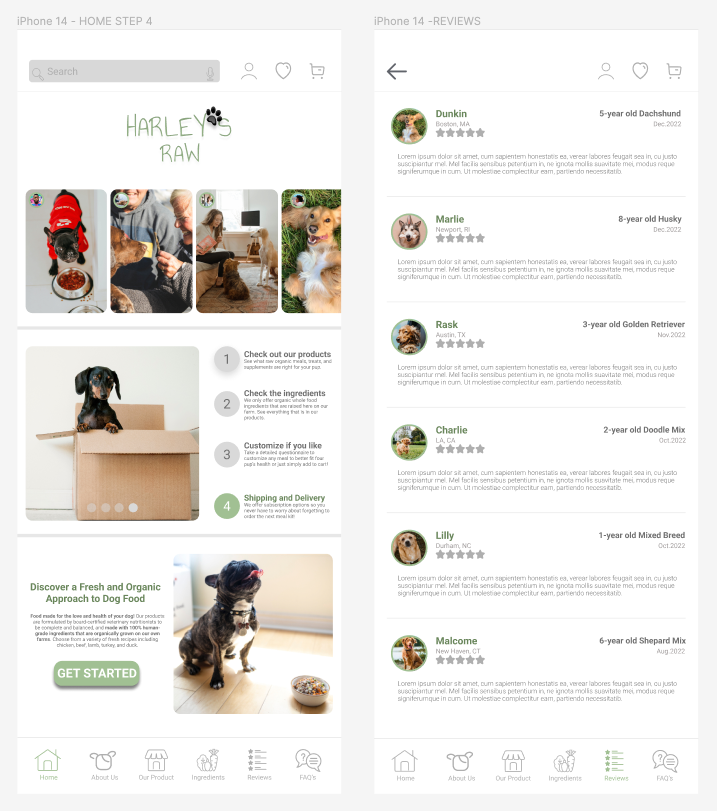
MOCK-UP
Creating the brand identity using a customized logo, typography, color palette, icons, button & interaction designs.


